

CASE STUDY
Spot Security
Network Topology
Creating a dynamic map of resources in a cloud environment and visualizing the connections between them so users can quickly identify and remediate relevant security issues
Project Details
One of the newest products in Spot by NetApp suite, Spot Security is designed to keep a user’s cloud infrastructure secure by delivering continuous, automated security. Spot Security analyzes, detects, and prioritizes threats to surface the most critical vulnerabilities and provides actionable compliance, remediation, and prevention.
Our team was tasked with updating an existing network topology map bogged down by slow load times and a busy design. As Lead Product Designer, I focused on creating an elegant, yet powerful map that lives at the core of the Spot Security product functionality.
Company: NetApp
Business Unit: Public Cloud Services
Product: Spot Security by Spot by NetApp
Role: Lead Product Designer
Timeline: 3 months
Tools: Figma, AWS Console, Keylines (JavaScript Toolkit for Graph Visualization)
Deliverables: UI design, wireframes, prototypes, feature workflows, user flows, Spot Design System components
The Challenge
In the shared responsibility model of cloud security, it’s up to cloud customers to configure, manage, and enforce the necessary security measures that protect their cloud environments.
However, the average business produces millions of events every day, creating a lot of noise that can bury critical security threats under false alerts and low-impact issues. Wading through that massive amount of data to identify and understand actual risk and impact can be a huge waste of time and resources for DevOps and security teams.
Topology maps are the visual structure of relationships and links among elements and nodes within a network. These maps are powerful tools in providing complete visibility into a cloud environment and allowing the user to investigate security vulnerabilities. Spot Security needed a dynamic topology map feature to cut through the noise, identify the highest impact risks, and allow users to quickly remediate them.
Project Goals

Show All Resource Connections in Cloud Environment
Allow user to view all their resources and how they are interconnected and reachable from the internet

Allow User to Quickly Remediate Issues
Align with the overall product goal of allowing users to quickly remediate security and network issues

Highlight Security Findings
Overlay relevant security and network issues so users can spot them at a glance and investigate further

Determine Related Assets and Resources
Create a summary of the related assets, findings, and features from across the product in one place
Research
Competitive Analysis
The product team identified 15 competitors and leaders in the cloud security space and I put together an extensive analysis document incorporating each one and outlining their product details, values and differentiators, key features, and screenshots of their UI. I also included links to any product demos and walkthroughs that were available.
CloudHawk.io
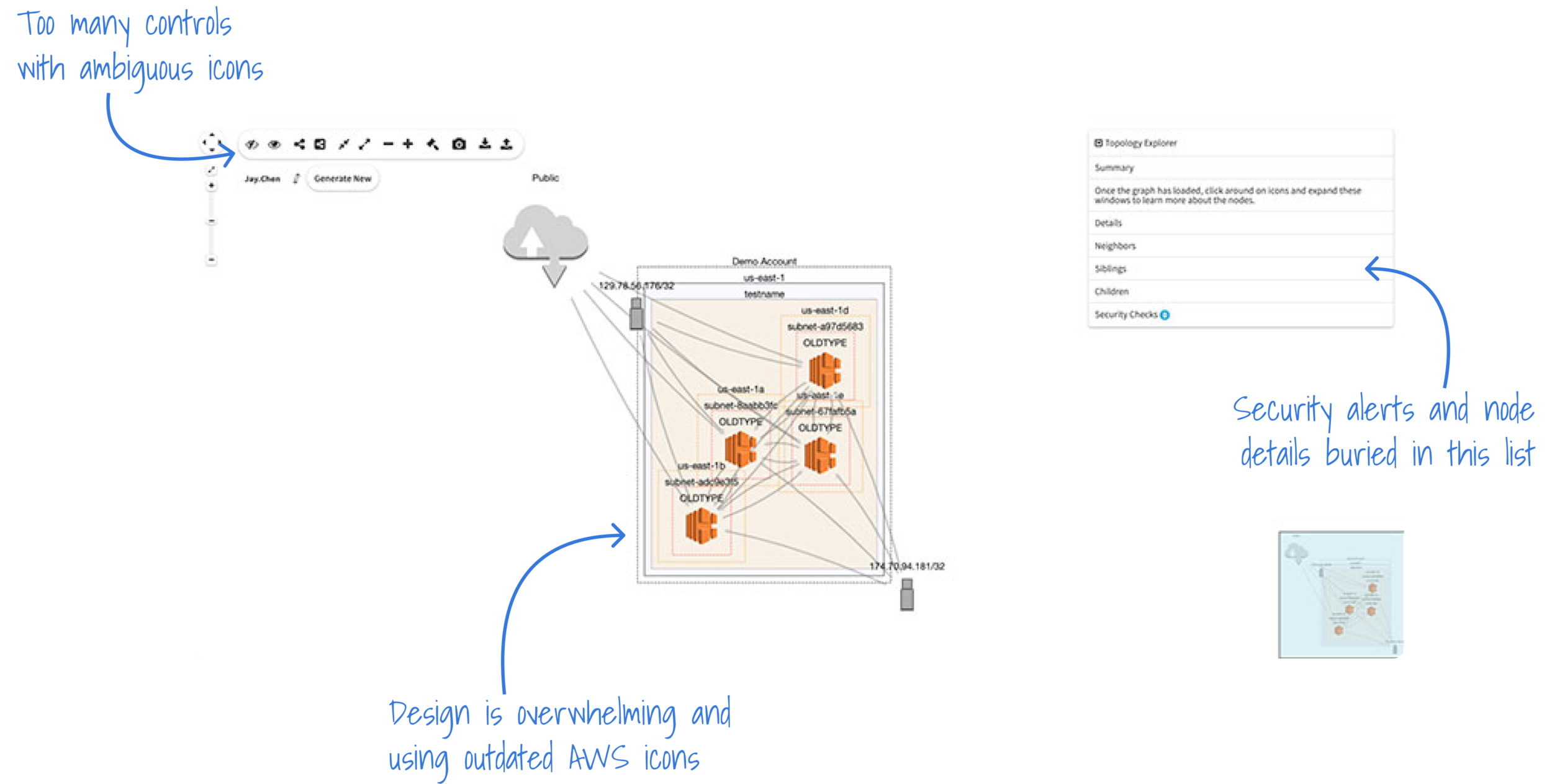
In late 2020, Spot by NetApp acquired CloudHawk.io, an agentless cloud infrastructure monitoring application that became the base of the Spot Security product. CloudHawk featured a topology map of the user’s cloud deployment overlaid with security monitoring findings, which was a great starting point for the updated Topology in Spot Security.
Through interviews with existing CloudHawk customers and general SecOps users, reviewing analytics data, and compiling an extensive competitive analysis, we identified a number of issues with the CloudHawk topology that we wanted to resolve in our new map feature:
Creating a design that is less busy and overwhelming
Highlighting security risks and issues more clearly
Mitigating extremely slow load times from showing massive amounts of nodes
Displaying affected resources and assets in one place
Incorporating the topology throughout the product
Existing CloudHawk.io Topology Design
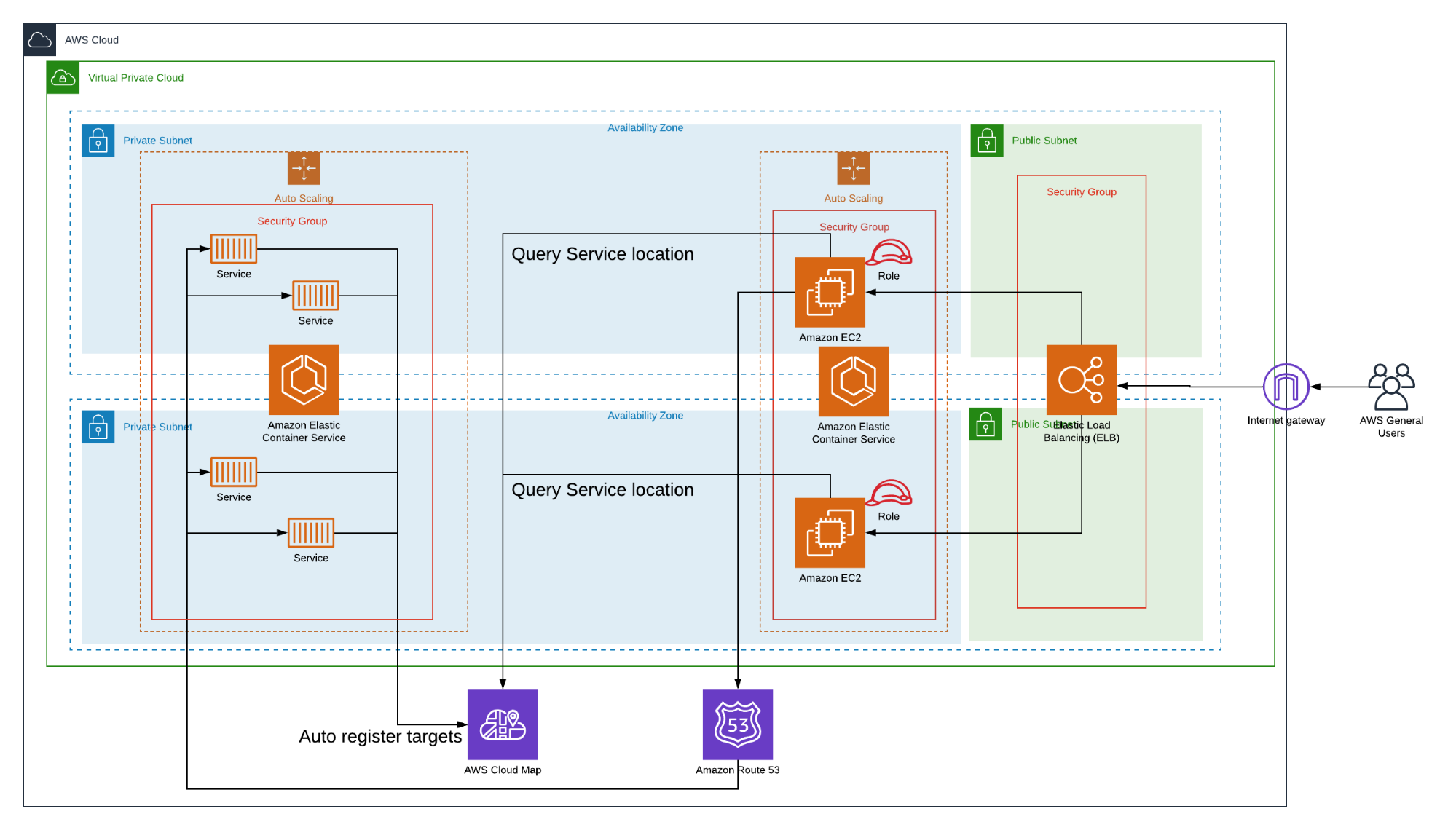
Leveraging the AWS Console
From speaking with existing customers and other DevOps and security engineers, we confirmed that these users were spending a lot of time in the AWS Console. Since our key users were already familiar with the structure and design of the console, we decided to continue incorporating the current service icons from AWS into our topology. We also looked at AWS Cloud Map and other diagram examples from the console for inspiration.
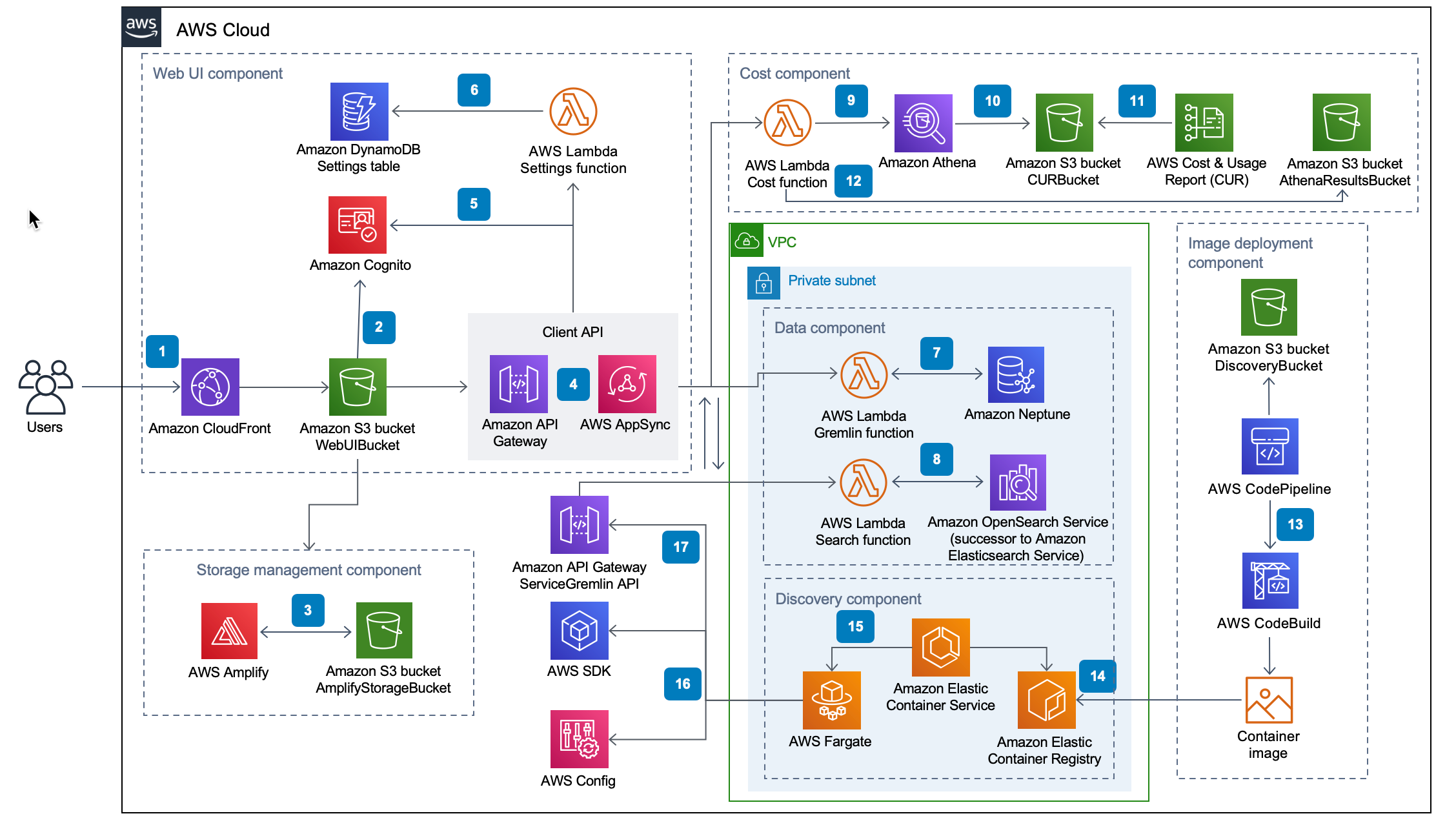
Examples of network diagrams from the AWS Console
Harnessing API Data & the KeyLines Toolkit
In order to make our Topology as powerful and interactive as possible, our engineering team built an API to pull in data from our user’s environments so we could highlight the most relevant information. We also utilized the KeyLines graph visualization toolkit for the basis of our Topology structure. KeyLines allowed customization of every element so we weren’t locked into any third-party designs and came with a lot of features baked in that made it perfect for building our complex map feature, such as:
Automatic Layouts
Optimized graph layouts along with the snap to grid behavior, allows us to maintain precise alignment and relative node order, even when a user moves nodes aroundPowerful Filtering
Making it easier for users to discover connections and interactions between nodes that aren’t immediately visible from a global viewTime-based Analysis
Cloud infrastructures are dynamic and often changing and the time bar-driven filtering lets our users see a breakdown of how their topology activity evolves over time.Node Combining
By showing users visual groupings of nodes and links that they can expand, collapse, nest, and move around, we were able to keep our design uncluttered and efficient
Getting Started
Information Architecture
I put together a diagram of the proposed Topology architecture for discussions with the Product team to more easily visualize and organize all of the content that needed to be available to our users in the feature.
The Solution
Customized Service Maps
We wanted to avoid having users drop into an unfiltered view of their entire cloud environments and have to wait for thousands of nodes to load before they could use the tool. To bypass this issue, we developed the concept of a Service Map, which allows a user to choose specific nodes in their environment, group them together, and save them as a view. Users can create as many Service Maps as they need for their workflow.
Initial Iterations
We initially considered implementing three different views for the topology: Logical, Network, and Policy. KeyLines did such a great job of automating these types of layouts that we wanted to utilize them.
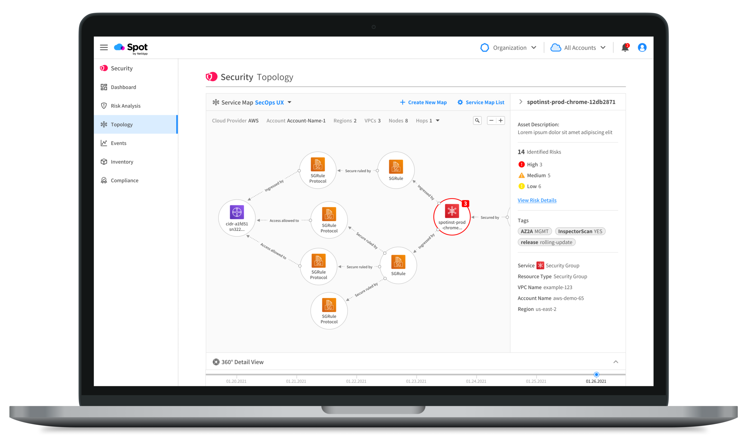
Final Solution
In the final design, we opted to automate on the back end which layout to show based on what data the user is viewing. The user can choose which Service Map they would like to view, as well as create a new one or view all of their existing maps. When a user selects a node, it will open up a right sidebar with node-specific metadata. The user can also view all of the related resources and assets in the 360° View bar at the bottom.
Creating a Service Map
Service Map List
Edit Service Map
Delete a Service Map
Risk Impact Map
Getting to the details of a security alert quickly is key for Spot Security. After considering the user flows for remediating risks, we decided that a version of our Topology map was the best way to allow users to investigate the details of a security risk. In the Topology map, we could show all the important alert metadata in the sidebar while simultaneously allowing the user to navigate through a visualization of all the resources connected to the specific risky node.
Initial Iterations
In our initial designs, our Risk Details view included a small version of the Topology map that the user could use to investigate, but most of. the data and affected resources were outside of the map.
Final Solution
The Risk Impact Map is a slight variation of our main Topology component. It isn’t read-only, but it is focused on the node with the security risk and allows the user to investigate from there. With the map as the main focus of this view, users can more easily explore the assets connected to the node while simultaneously seeing the relevant metadata in the sidebar.
360° View & Sidebar
Displaying affected resources and assets in one place was another challenge we wanted to solve from CloudHawk’s Topology feature. In order to get to the root of an alert, a user might have to dig through a lot of information to find what they need. With a Topology map that takes up the majority of the screen real estate, we needed a way to show large amounts of information without overloading the design (or the user). We decided to add two panels to the map structure that give users a summary of all of the related resources in their environment so they can quickly find the information they need to understand the issue and fix it quickly.
The right panel had the relevant metadata for the node that was prompting a security alert. The bottom panel became the 360° View, which is an overlay of all of the resources in the environment related to the selected node categorized by Risks, Compliance Standards, Inventory, Policies, and Events.
Initial Iterations
We tried a few different sidebar layouts, some that were static and some that the user could expand or collapse. We also had planned for a map legend but realized that we had over 50 unique node icons and it quickly became unwieldy when more than 5-10 nodes were showing in the view at a time.
Final Solution
The right panel opens automatically when a user clicks on a node. Users can minimize the panel or if they click away from the node it will collapse again. Users can have both the right panel and 360° View open at once.
Design & Ideation
Spotlight Design System & Existing Components
As we were ideating on designs for the Topology map, I met with other designers in the Spot by NetApp design guild to see if there were any existing components in their products that could be useful. Luckily for us, the lead designer for Ocean for CD was also building a map feature to visually display Rollouts.
We were able to work together on design solutions to create a flexible map feature that could be added to Spotlight, our Design System, and used throughout the rest of the Spot product suite.
Node Styles from Ocean CD Rollouts
Final Design Guidelines for Spot Security Topology
We took the general design from the Ocean CD map nodes and created a variation with round nodes that works better for Topology map layouts. We also incorporated the service icons from AWS and an error alert count.
Final Thoughts
Spot Security in Preview
The Spot Security product is currently in a private preview phase with new and existing Spot by NetApp customers. We selected a number of these users to be design partners and we meet with them frequently to get direct feedback on the features we are releasing. From this feedback directly, we have been able to make a lot of the improvements outlined above from initial iterations, such as the 360° View.
I am also utilizing FullStory, a great tool for getting real-time user experience data, by setting up funnels for all of our workflows so we can see the conversion rates for different segments of our users. With FullStory, I can watch recorded user sessions to identify paint points where our users are struggling and prioritize design updates in the sprint cycles to optimize the experience.